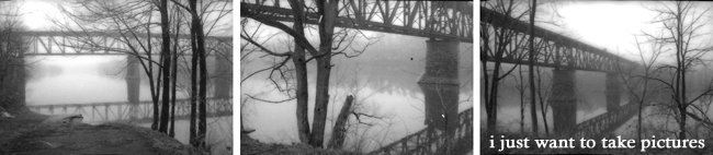
Here are five enlargements I made for the Mx reviews last fall.
This image, for now, is the only one I am going to enlarge as a final. It was one of the first pictures I took and believe it is, somehow, one of the most successful. My favourite aspect of the image is the (completely accidental) and perfect symmetry between the building on the left and the shadow on the right. If you refer to the last post, you'll notice that I have cropped out a large portion of the image and think it's much better composed that way (though it needs quite a bit of work in the actual dark room, still).
This image, for now, is the only one I am going to enlarge as a final. It was one of the first pictures I took and believe it is, somehow, one of the most successful. My favourite aspect of the image is the (completely accidental) and perfect symmetry between the building on the left and the shadow on the right. If you refer to the last post, you'll notice that I have cropped out a large portion of the image and think it's much better composed that way (though it needs quite a bit of work in the actual dark room, still).

I sort of attempted to see the irony (?) in this image of what looks like a corn field and the school of architecture... however, I believe it turned out (or was at least received that way) as being picturesque or sentimental, which was not the intent.

There is something about this image I really enjoy. It's a bit of a pain to develop b/c the drastic difference in contrast, but I think, done well, it could look really good. I might try and take a similar picture from a slightly different angle... though I like this image... there is something that doesn't quite feel right.

maybe... ? Not sure.

I could take it or leave it.


So far, working with these, your judgment is crystal-clear. The 'cornfield' IS sentimental. Keep it up so you know what you AREN'T doing.
ReplyDelete