April 21st 2009
I am a bit anxious about reprinting photographs I already did just b/c they're not on glossy. But I want everything to look cohesive and professional so I guess it has to be done.
First up - 3 mailboxes & open/closed. I remember these being somewhat of a pain to print, so I am not too excited about it.
The first issue seems to be the difference in paper - not just pearl vs glossy. Apparently, every batch of paper can be slightly different because of the chemistry used to produce it.
So no the image, which I thought wold take just 15mins or to reproduce is going to take quite a bit longer - I need to iron all the kinks out.
April 22nd 2009
Yesterday did not go well. I printed two images, neither of which I am satisfied 100% with. The open/closed is a train wreck - not less than 3 issues: I messed up on masking, should have exposed the frame longer and this SPOT appeared out of nowhere. It's on the emulsion side of the negative and I can't get rid of it. Bob has a solution I can use to manually touch up the actual print, so we'll see.
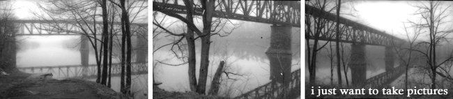
I decided to stay away from 're-printing' anything today and I am printing two brand new images - great train bridge pictures taken from underneath the structure.
I have to admit - the only reason I stuck it out yesterday as long as I did is because of this schedule I've made - I can't fall behind, even a bit, if I want to defend on July 16th.
[part way through printing]
Today is going drastically better - the images in the T1 train bridge series were all taken one after another and have the same subject matter so the exposures are very similar. There will need to be adjustments, no doubt, but I may even accomplish 3 prints today.
Because they were taken in foggy conditions, the atmosphere of these images is every different than others I've printed. I am debating on sacrificing increased contrast (and true blacks and whites) to focus on a wide range of greys.
OR, do I sacrifice detail for a feeling of immensity and power??
[after printing]
The images are great. I am not sure what order I will be presenting the triptych, but I managed to print all three components today, which is excellent. I decided to forget about true blacks and focused, instead, on depth. There is a lot of detail within the structure of the bridge, and I thought it was more important to capture that.
I am a bit anxious about reprinting photographs I already did just b/c they're not on glossy. But I want everything to look cohesive and professional so I guess it has to be done.
First up - 3 mailboxes & open/closed. I remember these being somewhat of a pain to print, so I am not too excited about it.
The first issue seems to be the difference in paper - not just pearl vs glossy. Apparently, every batch of paper can be slightly different because of the chemistry used to produce it.
So no the image, which I thought wold take just 15mins or to reproduce is going to take quite a bit longer - I need to iron all the kinks out.
April 22nd 2009
Yesterday did not go well. I printed two images, neither of which I am satisfied 100% with. The open/closed is a train wreck - not less than 3 issues: I messed up on masking, should have exposed the frame longer and this SPOT appeared out of nowhere. It's on the emulsion side of the negative and I can't get rid of it. Bob has a solution I can use to manually touch up the actual print, so we'll see.
I decided to stay away from 're-printing' anything today and I am printing two brand new images - great train bridge pictures taken from underneath the structure.
I have to admit - the only reason I stuck it out yesterday as long as I did is because of this schedule I've made - I can't fall behind, even a bit, if I want to defend on July 16th.
[part way through printing]
Today is going drastically better - the images in the T1 train bridge series were all taken one after another and have the same subject matter so the exposures are very similar. There will need to be adjustments, no doubt, but I may even accomplish 3 prints today.
Because they were taken in foggy conditions, the atmosphere of these images is every different than others I've printed. I am debating on sacrificing increased contrast (and true blacks and whites) to focus on a wide range of greys.
OR, do I sacrifice detail for a feeling of immensity and power??
[after printing]
The images are great. I am not sure what order I will be presenting the triptych, but I managed to print all three components today, which is excellent. I decided to forget about true blacks and focused, instead, on depth. There is a lot of detail within the structure of the bridge, and I thought it was more important to capture that.


